
Browse my collection of instructional guides, including infographics, job aids, and visuals designed to enhance learning and support skill development. Click each image to view the full-sized image or click on "PDF Version" to open the high-resolution file.
Related Content


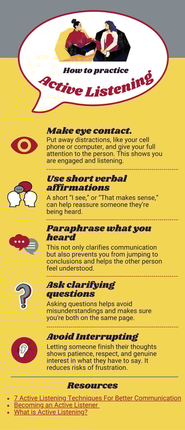
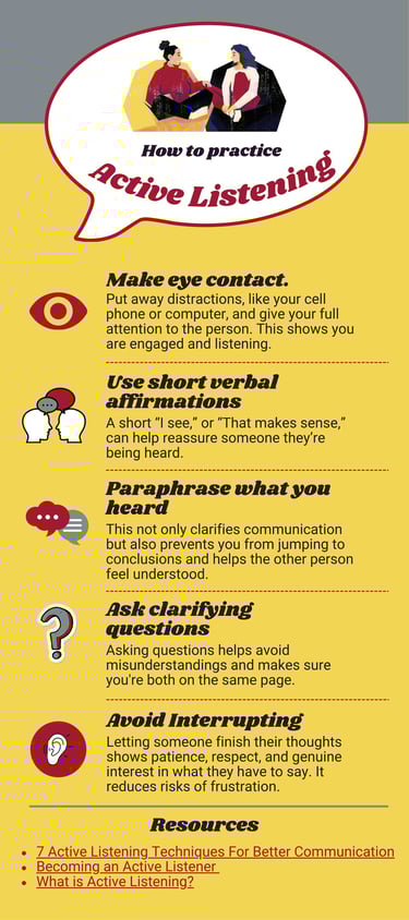
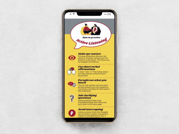
This infographic, titled "How to Practice Active Listening," visually outlines five key techniques for improving communication. It includes colorful illustrations and brief descriptions for each strategy: making eye contact, using short verbal affirmations, paraphrasing what you heard, asking clarifying questions, and avoiding interrupting. The infographic emphasizes respectful and empathetic communication and includes a section at the bottom with three linked resources for further reading. It uses a red, yellow, and gray color scheme with stylized icons beside each point. A PDF version is available on the site, though its accessibility has not yet been confirmed.
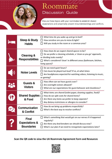
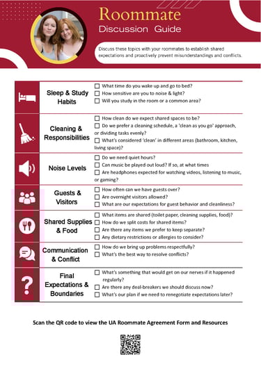
This infographic titled “Roommate Discussion Guide” is designed to help college students establish clear expectations with their roommates and proactively prevent conflicts. It features a maroon and gold color scheme aligned with University of Alabama branding and includes icons and checkboxes next to discussion prompts. Topics are divided into seven categories: Sleep & Study Habits, Cleaning & Responsibilities, Noise Levels, Guests & Visitors, Shared Supplies & Food, Communication & Conflict, and Final Expectations & Boundaries. Each category lists 2–4 questions to guide conversation, such as cleaning standards, guest rules, and how to handle problems respectfully. At the bottom, a QR code is provided for students to access the UA Roommate Agreement Form and related resources.
Related Content


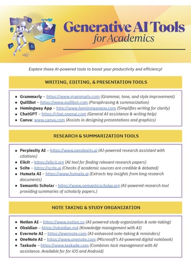
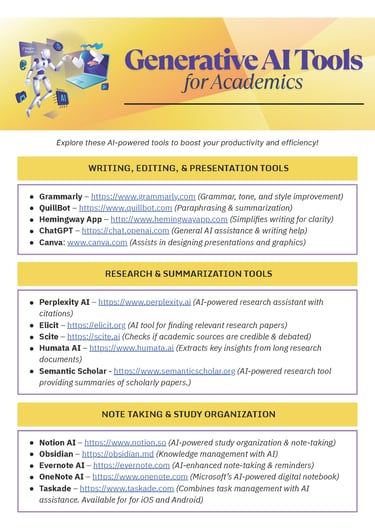
This infographic titled “Generative AI Tools for Academics” features a vibrant yellow, purple, and orange gradient design with an illustration of a robot interacting with digital tools. The infographic is divided into three sections, each highlighting AI-powered tools with their URLs and brief descriptions of their academic applications. The sections are: Writing, Editing, & Presentation Tools (featuring Grammarly, QuillBot, Hemingway App, ChatGPT, and Canva), Research & Summarization Tools (including Perplexity AI, Elicit, Scite, Humata AI, and Semantic Scholar), and Note Taking & Study Organization (listing Notion AI, Obsidian, Evernote AI, OneNote AI, and Taskade). A short caption encourages viewers to explore these tools to increase productivity and efficiency in academic work.
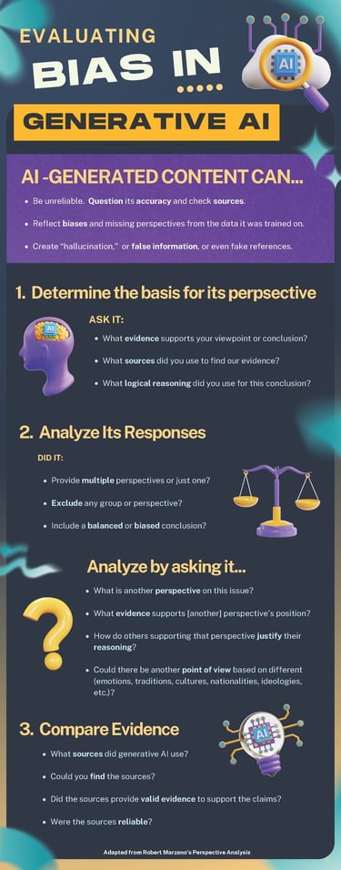
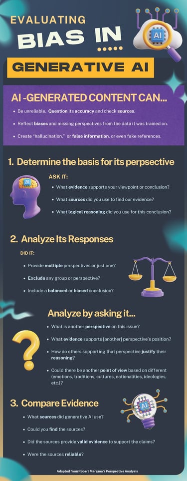
This infographic titled “Evaluating Bias in Generative AI” uses bright, futuristic visuals with neon purples, blues, and yellows to introduce strategies for critically analyzing AI-generated content. It opens with a warning that AI-generated content can be unreliable, biased, or even contain false information. The infographic outlines three main steps for evaluating bias: (1) Determine the basis for its perspective by asking about evidence, sources, and reasoning; (2) Analyze its responses to see if they include multiple perspectives, avoid exclusion, and are balanced; and (3) Compare evidence by examining the sources AI used, their validity, reliability, and accessibility. The infographic features icons of brains, scales, question marks, and AI chips and is adapted from Robert Marzano’s Perspective Analysis framework.


PDF Version Lesson 1
PDF Version Lesson2
Related Content


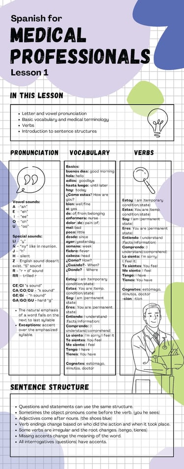
This infographic titled “Spanish for Medical Professionals: Lesson 1” is a beginner-friendly guide organized into four key sections—pronunciation, vocabulary, verbs, and sentence structure. It includes Spanish vowel sounds, special pronunciation rules, and basic medical vocabulary such as "enfermera" (nurse), "dolor" (pain), and "fiebre" (fever). Common verbs like "estar," "ser," "tener," and "sentir" are shown with their English meanings. It also explains sentence structure tips, including subject-verb order, adjective placement, verb endings, and accent usage. The infographic features clean gridlines, playful abstract shapes, and illustrations of a doctor and light bulb icons, combining education with a visually approachable style.
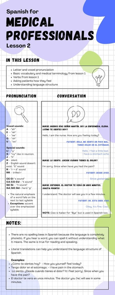
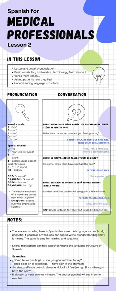
This infographic, titled “Spanish for Medical Professionals: Lesson 2,” provides a continuation of foundational Spanish for healthcare workers. It includes pronunciation guidance, a sample nurse-patient conversation, vocabulary, and helpful language structure notes. The dialogue walks through a basic interaction where a nurse asks a patient how they feel, the patient describes stomach pain, and the nurse provides a comforting response. The visual layout includes phonetic pronunciation tips for Spanish vowels and special sounds. A “NOTES” section at the bottom explains literal translation examples, reinforcing understanding of sentence structure. The design features a gridded background, illustrated icons, and playful abstract shapes for a visually approachable tone.
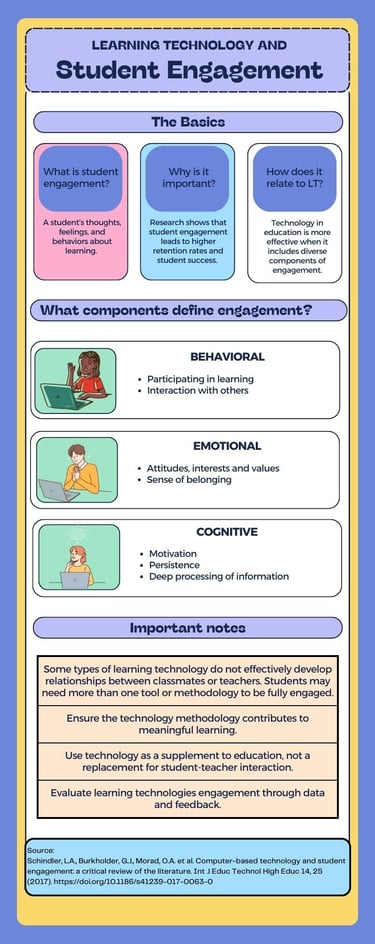
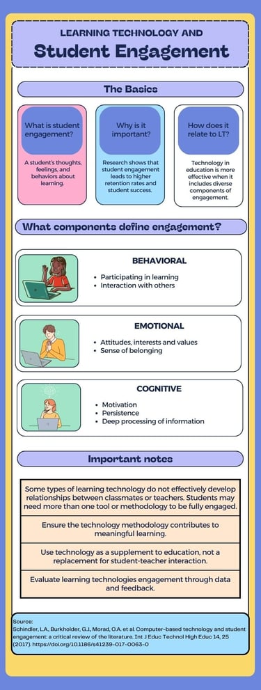
This infographic titled "Learning Technology and Student Engagement" outlines key concepts, definitions, and considerations for effectively engaging students through educational technology. The top section labeled “The Basics” defines student engagement as the thoughts, feelings, and behaviors associated with learning. It highlights its importance in improving retention and success rates and states that learning technology (LT) is most effective when it incorporates various engagement types. The next section explains the three primary components of engagement: behavioral (participation and interaction), emotional (attitudes, interests, and sense of belonging), and cognitive (motivation, persistence, and deep information processing), each accompanied by simple illustrations of students working on laptops. The infographic concludes with a set of important notes emphasizing the need to use multiple methodologies, to ensure technology supports meaningful learning, and to supplement—rather than replace—human interaction. It also encourages educators to evaluate engagement through data and feedback. A citation at the bottom credits the infographic’s source.
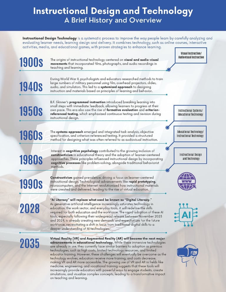
Timeline infographic showing the evolution of instructional design and technology from the 1900s to 2035. Key milestones include visual/audio tools (1900s), systematic design from WWII (1940s), programmed instruction (1950s), systems approach (1960s), cognitive theory (1980s), constructivism and digital learning (1990s), AI literacy focus by 2028, and widespread use of AR/VR in education by 2035.
See also...
Check out some of my other projects.


Storyline 360 Projects
Storyline 360 with ChatGPT
E-learning Courses
Multimedia
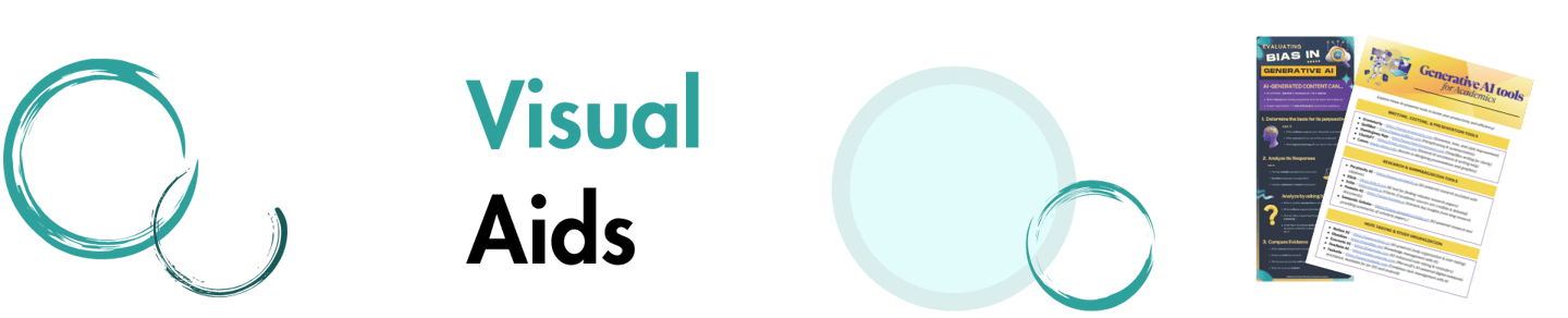
Visual Aids
Project Planning
Home Page
Resumé
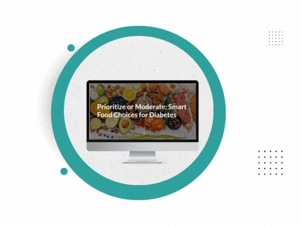
Image of Food Choices for Diabetics project on a monitor surrounded by animated circular graphics
Gif image. A floating robot looks at a computer and back at the camera. Scene changes to Handling Customer complaints on a lap top on a desk while a person types on the computer.
A laptop on a table with a white background is playing the video Keller's ARCS theory. Circle graphics slowly float on the right of the image.
Image of project on a lap top sitting on a desk with a white background.
Active listening infographic displayed on a cell phone. A speech bubble is at the top showing illustration of two women talking.
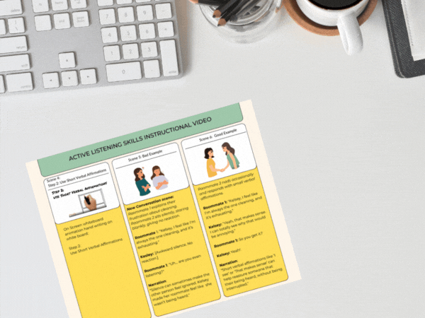
Colorful storyboard for Active Listening Video is on a desk.
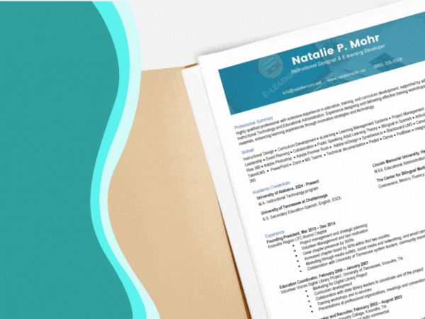
Panning image of Natalie P Mohr's resume in an open file folder.
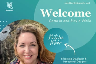
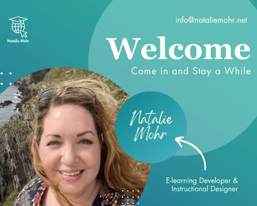
Home page image showing Natalie Mohr in a circle at the ocean with a rocky cliff. Pictured in Polperro, Uk. Welcome. Come and Stay a While. Natalie Mohr
Take a look at some of my favorite tools.
Articulate 360, Articulate Rise, Canvas, Blackboard LMS, TalentLMS, TalentCards Mobile LMS, Padlet, Loom, Adobe Photoshop, Adobe Illustrator, Canva, Adobe Acrobat Pro, Adobe Fonts, Microsoft Word, PowerPoint, Figma, Create Studio, Powtoons, Vyond, Audacity, Microsoft Clipchamp, GitHub, Amazon S3, Microsoft Teams, ChatGPT, Dall-E, Eleven Labs, Synthesia, Camtasia, Kahoot
info@nataliemohr.net
This site is optimized for accessibility. Select all or use a screen reader to view hidden text where applicable. Click here for more information.

Looking for an e-learning developer to transform your training? Let’s talk!
© 2025 Natalie Mohr Instructional Designs. All rights reserved.
All instructional content, simulations, voiceovers, and visuals presented in these projects are the intellectual property of Natalie Mohr. No part of these materials may be copied, distributed, shared, or republished, whether in whole or in part, without express written permission.
If you wish to use any portion of this content in an educational or training setting, please contact: info@nataliemohr.net. Permission is granted on a case-by-case basis.
Some projects collect visitor IP addresses for security and misuse prevention.
For more information, please visit my USAGE POLICY.
Have a question about me or my services?
Feel free to click on the chat icon to ask my AI assistant.