My Design Process
Design Approach:
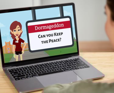
Dormageddon

Analysis
Researched typical roommate conflicts in university settings
Used pre-established subject matter expert material, learning objectives, and problems provided in the challenge
Determined an asynchronous online format with gamification would maximize engagement
Developed detailed learner personas based on undergraduate student characteristics
Design Phase
The design phase focused on crafting a structured, learner-centric experience aligned with the course's goals.
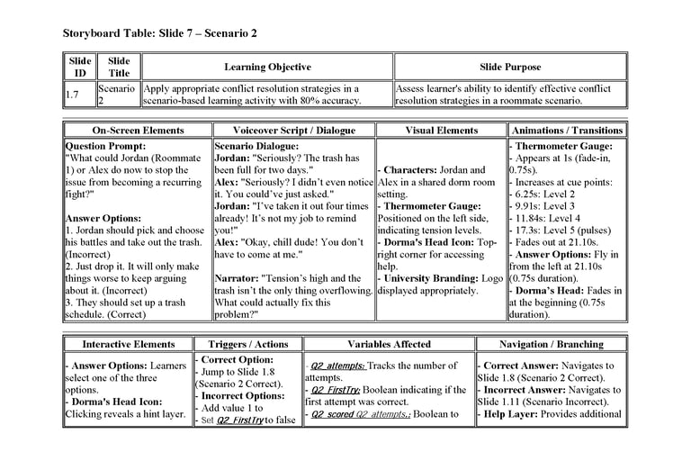
Created detailed scenario storyboards mapping objectives, scenarios, branching logic, feedback, and consequences
Created Visual Mockup:
Established the color palette, fonts, button styles, and character animation styles to ensure visual consistency
Followed University of Alabama branding guidelines

Development Phase
During the development phase, various tools were used to create and edit the full experience:
Built fully functional interactive prototype in Articulate Storyline 360
Integrated character animations and scenario videos
Generated and edited voice content with ElevenLabs.io and Audacity
Designed visual elements with Adobe Photoshop and Canva
Implemented JavaScript-driven scoring system with variable tracking
Developed dynamic visual feedback elements (conflict thermometer, progress bar)
Implementation Plan
Deployment Strategy:
Outline strategy for LMS integration with Blackboard
Added accessibility features including alt text and closed captioning
Designed completion certificate and verification system to track degree of learning.
Evaluation Phase
Formative Learner Evaluation:
Created a complete four-level Kirkpatrick evaluation post-course evaluation
Created summative case study analysis to measure learning transfer
Established metrics to track hypothetical reduction in housing change requests
Future Enhancements
Expanding the course to include additional scenarios addressing other common roommate conflicts.
Exploring opportunities to adapt the course for broader audiences, such as off-campus students or those in different institutions.
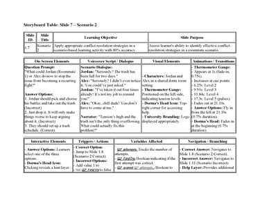
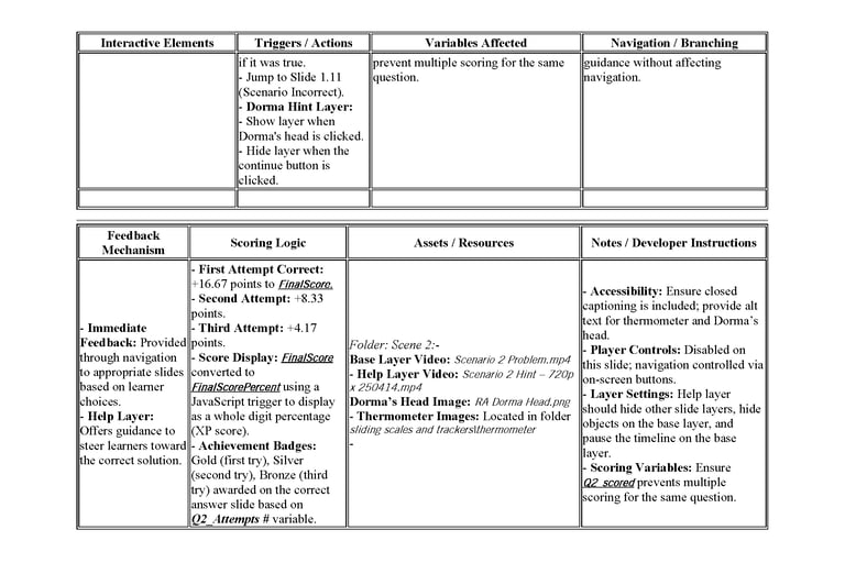
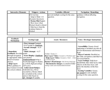
Click image to view pdf of storyboard
Click image to view pdf of storyboard
Designed interaction patterns featuring meaningful choices with visible consequences
Implemented gamification elements including XP tracking, levels, and badges and visual progress bar.
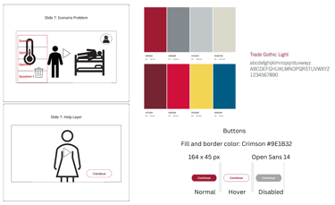
Click on image to view full-size visual Mock-up showing two slides, branded color scheme, navigation buttons, and font.
This visual mock-up represents a storyboard and style guide for an interactive e-learning scenario focused on conflict resolution in a dorm setting. The left side includes Slide 7, which shows a learner decision point with a stylized thermometer graphic indicating escalating tension, three response options, and a floating help icon. A secondary view of Slide 7 displays the Help Layer, featuring a female character and a “Continue” button. On the right, a full color palette is presented, including the following HEX codes: #9E1B32 (crimson), #928A8F (gray), #C1C5C9 (light gray), #DAD7CB (pale beige), #772432 (deep red), #D0103A (bright red), #F2D653 (yellow), and #005C84 (deep blue). The design also includes a style guide for buttons, with a 164 x 45 px size, crimson border and fill, and states for normal, hover, and disabled. Typography for the project uses Trade Gothic Light for headers and Open Sans at 14 pt for body text. This mock-up guides the visual and functional consistency of the e-learning simulation.
This visual mock-up represents a storyboard and style guide for an interactive e-learning scenario focused on conflict resolution in a dorm setting. The left side includes Slide 7, which shows a learner decision point with a stylized thermometer graphic indicating escalating tension, three response options, and a floating help icon. A secondary view of Slide 7 displays the Help Layer, featuring a female character and a “Continue” button. On the right, a full color palette is presented, including the following HEX codes: #9E1B32 (crimson), #928A8F (gray), #C1C5C9 (light gray), #DAD7CB (pale beige), #772432 (deep red), #D0103A (bright red), #F2D653 (yellow), and #005C84 (deep blue). The design also includes a style guide for buttons, with a 164 x 45 px size, crimson border and fill, and states for normal, hover, and disabled. Typography for the project uses Trade Gothic Light for headers and Open Sans at 14 pt for body text. This mock-up guides the visual and functional consistency of the e-learning simulation.
Design Approach:
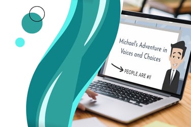
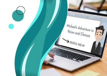
Michal's Adventures in Voices and Choices (Proof of Concept)
Analysis
In this conceptual scenario, the Analysis phase focused on understanding the performance problem and determining whether instruction could solve it. I would begin by meeting with key stakeholders, such as a corporate executive overseeing all U.S. sites, two regional supervisors, and an HR executive, to clarify expectations and desired outcomes.
During this phase, I would conduct both learner and task analyses to define the goals of the training program. To better understand the organizational needs, I would review:
Annual HR reports
Previous employee satisfaction surveys
Data from earlier training programs
Records of inclusivity- or diversity-related complaints
This analysis would support a gap analysis to determine what skills supervisors needed to successfully meet organizational expectations. A conceptual illustration would also be created to outline the steps supervisors must master to demonstrate the desired behaviors.
Training Goal
The overall goal was to see a 30% increase in employee satisfaction annual surveys and a 50% reduction in HR complaints regarding inclusivity and diversity.
Additional Considerations Informing My Design
HR data showed employees felt previous trainings were not engaging, so the new training needed to be interactive and motivating.
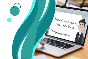
To increase engagement, I incorporated entertaining elements, including punchlines and audio clips from The Office, using Michael Scott as a humorous negative example of diversity and inclusion behaviors.
I integrated gamified elements to create “moments of delight” and maintain learner attention.
A personalization feature was added, allowing learners to enter their name, which appears in coach dialogue and in the final award certificate.
Design Phase
During the Design phase, I created a structured learning experience aligned to the goals identified in Analysis. This began with developing a text-based storyboard for each scenario, mapping learning objectives, scenario narratives, branching decision paths, consequences, and feedback
This storyboard was then peer-reviewed by members of the instructional design community to ensure alignment and clarity.
Each scenario was intentionally learner-centric, allowing learners to make choices, experience consequences, and retry scenarios until mastery.
I then created a visual mock-up (also included as an image artifact) outlining:
Color palette
Typography
Button and interaction styles
Animation style and look/feel
Layout and navigation
These design decisions were also reviewed by peers before development began.
Development Phase
In the Development phase, I produced the multimedia assets and built the training program. This included animation, audio, visual components, and interaction logic.
Multimedia Tools Used
Vyond Studio – animated character videos
Jammable – AI voice training and generation
Media.io – background noise removal
Audacity – audio editing
Clipchamp – video editing
Adobe Photoshop – image editing and preparation
All assets were integrated into Articulate Storyline 360, where I created the branching logic and interactions. Iterative reviews throughout development enabled refinement dialogue, visuals, interface behavior, and scenario paths.
Interactive Prototype
I shared my project with other instructional designers for actual feedback. A working prototype was developed in Storyline, including the welcome screen, opening scene, assistant introduction, and the first branching scenario and outcome slides.
Based on real peer feedback, several improvements were made:
Simplifying the Storyline player for cleaner user experience
Clarifying the learner’s role at the start
Enhancing the employee satisfaction progress graphic to make progress more intuitive and rewarding
Adding guidance to enable audio or closed captions as needed
Click to view visual mock-up
Click to view storyboard
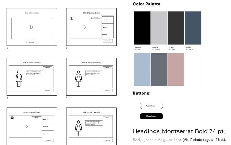
This visual mock-up outlines the layout and user interface of a scenario-based e-learning project titled “Michael’s Adventures in Voices and Choices.” It features six wireframe-style slides showing the linear flow of interaction: an introduction with video, question screens with three answer options, and both correct and incorrect feedback screens. The design also includes a progress bar, floating help icon, and consistent “Continue” buttons throughout. To the right, the color palette is displayed with HEX codes: #000000 (black), #C8CACA (light gray), #333333 (dark gray), #455467 (muted blue), #AEC1D6 (pale blue), #585E67 (charcoal blue), #C5A6A5 (dusty rose), and #FFFFFF (white). Typography for the project uses Montserrat Bold at 24 pt for headings and Josefin-Regular at 18 pt for body text, with Roboto Regular at 16 pt as an alternate. The button designs are shown in both outlined and filled formats to ensure visual consistency and accessibility across interaction states.
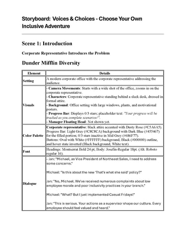
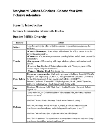
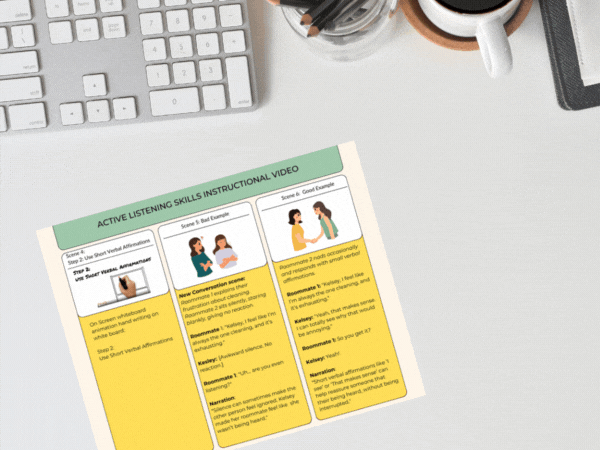
This storyboard outlines Scene 1 of the e-learning scenario Voices & Choices – Choose Your Own Inclusive Adventure. The setting is a modern corporate office where a corporate representative introduces the diversity and inclusion challenge. Visuals include camera movements that zoom in on the speaker, with an office background featuring large windows and motivational posters. A progress bar displays 0 out of 3 stars with placeholder text about progress tracking. The floating manager’s head icon is not shown yet.
The color palette includes Dusty Rose (#C5A6A5), Light Grey (#C8C8CA), Dark Blue (#455467), Mid Grey (#686F77), and standard white and black button states. The font choices are Montserrat Bold 24 pt for headings and Josefin-Regular 18 pt for body text, with Roboto Regular 16 pt as an alternate.
Dialogue between Jan and Michael introduces the scenario’s conflict: Michael’s leadership has prompted concerns about inclusivity. Jan confronts him about inappropriate practices and reminds him that leadership shapes workplace culture.
Evaluation Plan
Formative Evaluation
Ongoing improvements would occur through:
Usability testing
Stakeholder feedback
Pilot testing with a small learner group
Refinement of content and interface based on findings
Implementation Plan
I would coordinate with HR and training teams to schedule and deliver the course to supervisors across all regional sites. This would involve:
Uploading the module to the LMS and testing for compatibility and accessibility
Preparing facilitators or support staff
Providing a brief deployment guide outlining objectives, technical requirements, and access instructions
I would monitor early participation and address any technical issues to ensure a smooth rollout.
Results would be compared to baseline data collected in the Analysis phase to determine whether the training contributed to the targeted 30% increase in satisfaction and 50% reduction in complaints. A continuous improvement cycle would follow to ensure ongoing effectiveness.
Summative Evaluation
After full deployment, I would evaluate the impact through:
Post-training learner surveys and interviews
Scenario completion and performance data
Changes in employee satisfaction survey scores
HR metrics related to inclusivity and diversity complaints
Project Planning
Click below to view project development documents including a storyboard, learning plan, course design plan, and project management plan.
info@nataliemohr.net
This site is optimized for accessibility. Select all or use a screen reader to view hidden text where applicable. Click here for more information.
Looking for an e-learning developer to transform your training? Let’s talk!
© 2025 Natalie Mohr Instructional Designs. All rights reserved.
All instructional content, simulations, voiceovers, and visuals presented in these projects are the intellectual property of Natalie Mohr. No part of these materials may be copied, distributed, shared, or republished, whether in whole or in part, without express written permission.
If you wish to use any portion of this content in an educational or training setting, please contact: info@nataliemohr.net. Permission is granted on a case-by-case basis.
Some projects collect visitor IP addresses for security and misuse prevention.
For more information, please visit my USAGE POLICY.
Have a question about me or my services?
Feel free to click on the chat icon to ask my AI assistant.